01 / Digital directionSelected work
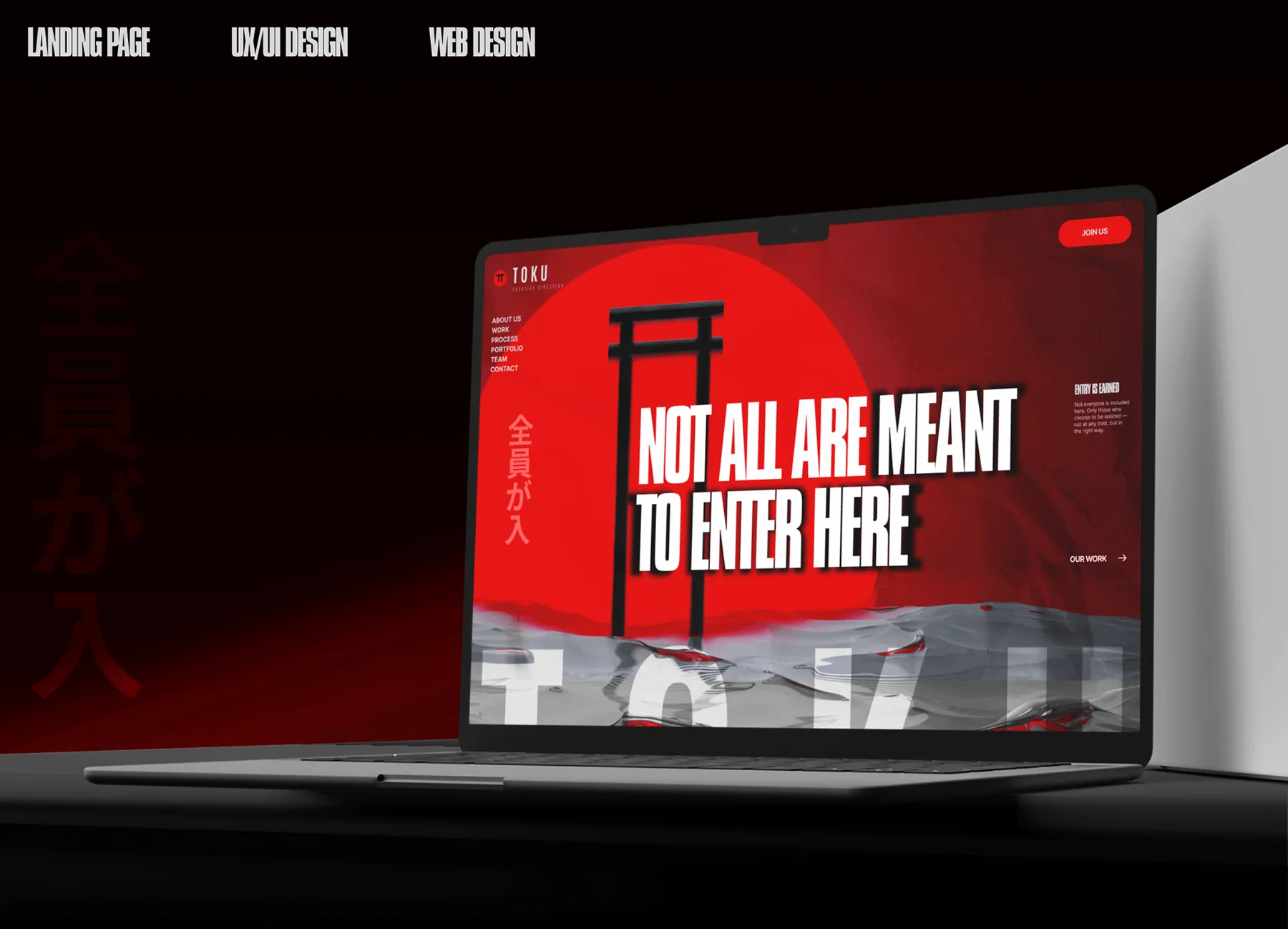
TokuEnter with intent.
A high-impact landing experience built through red-and-black contrast, compressed typography and a visual language informed by Japanese culture and brutalist restraint.
View project ↗A selection of RIOTIV web design, UI/UX and brand work. Different categories, different visual answers, and the same focus on clarity, identity and digital experience.
View projects ↘A high-impact landing experience built through red-and-black contrast, compressed typography and a visual language informed by Japanese culture and brutalist restraint.
View project ↗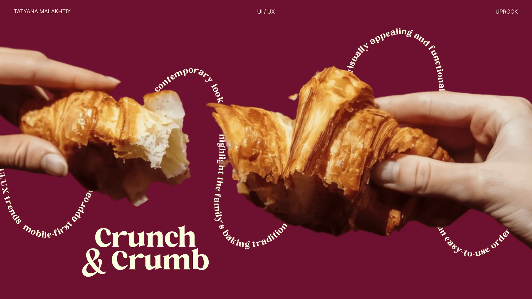
A bakery identity and website direction balancing warmth and appetite with a clean ordering experience and a recognizable visual system.
View project ↗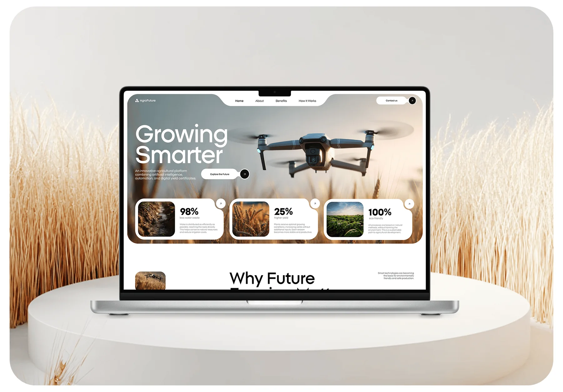
An agri-tech experience designed to make data-driven farming feel credible without losing the human reality of fields, farmers and physical work.
View project ↗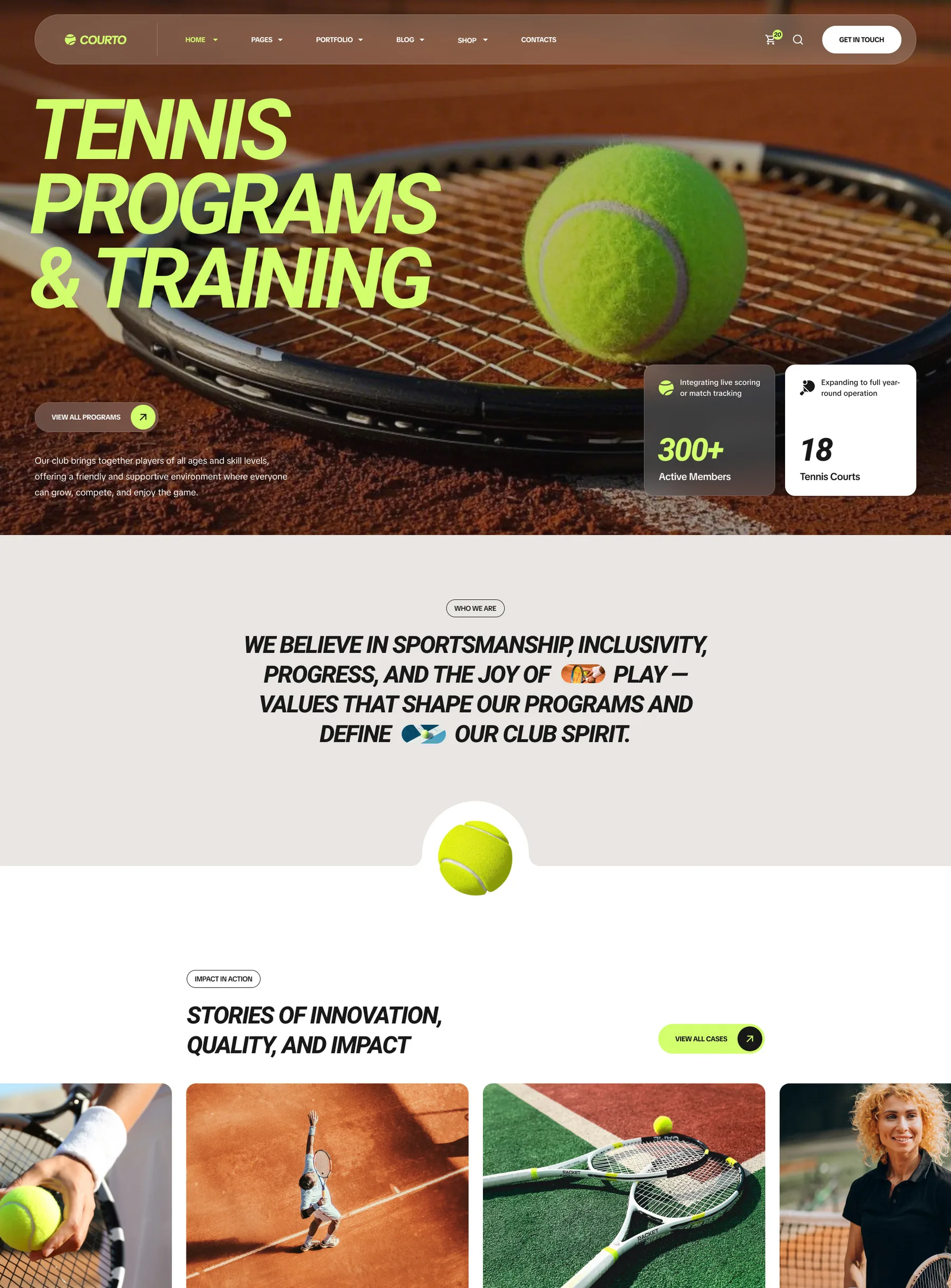
A modular sports website direction spanning padel, coaching and tennis programs with high energy and clear program navigation.
View project ↗Different categories. Different visual answers. The same standard of attention.
Tell us what needs to change, what success looks like, and where you want the business to go next.
Start a conversation ↗