Selected work / 01
TOKU.
01 / 04
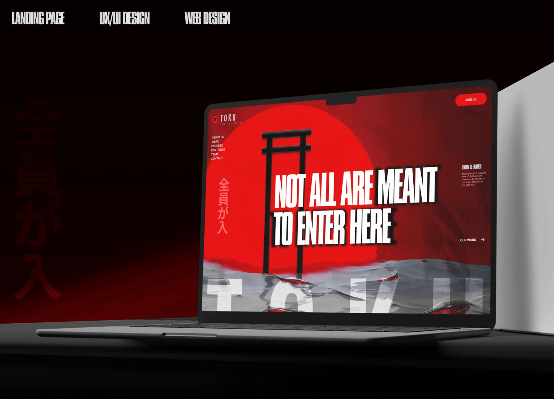
The idea
Restraint can still hit hard.
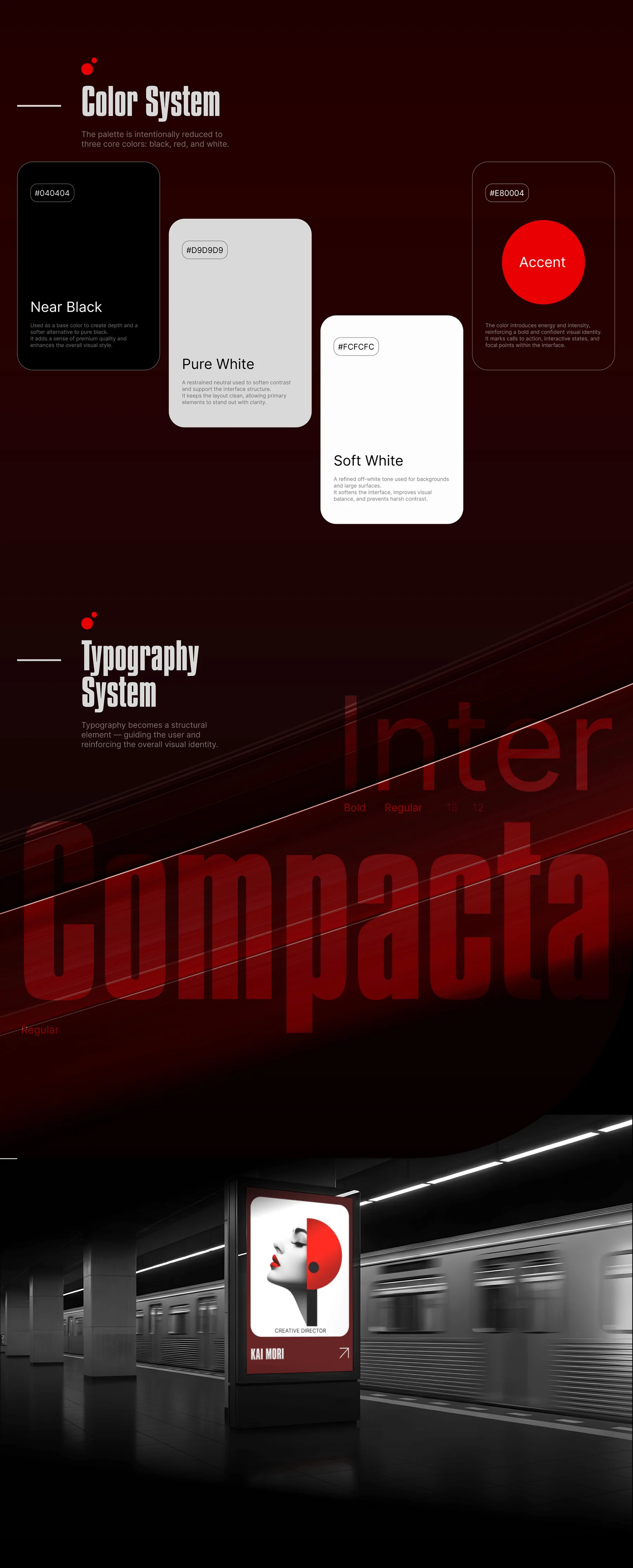
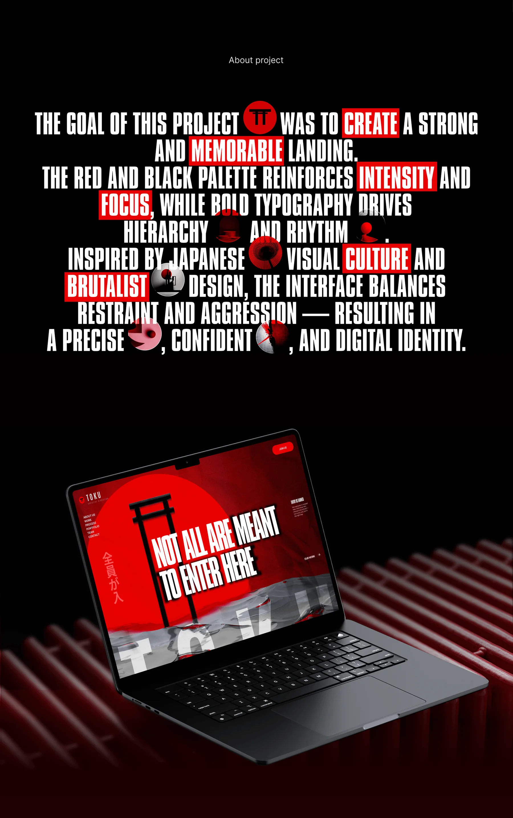
The goal was a strong, memorable landing experience. The system uses a focused red-and-black palette, compressed typography and sharp hierarchy to create intensity without losing control.
References to Japanese visual culture and brutalist design give the interface its edge. The result is deliberately confrontational in tone, but disciplined in structure.
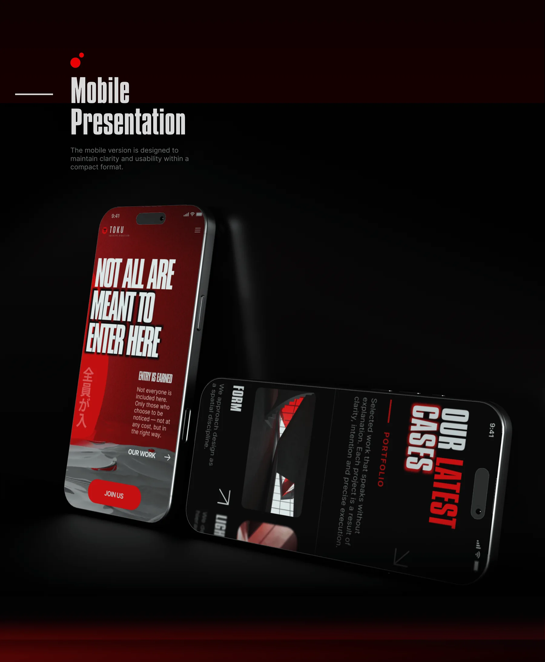
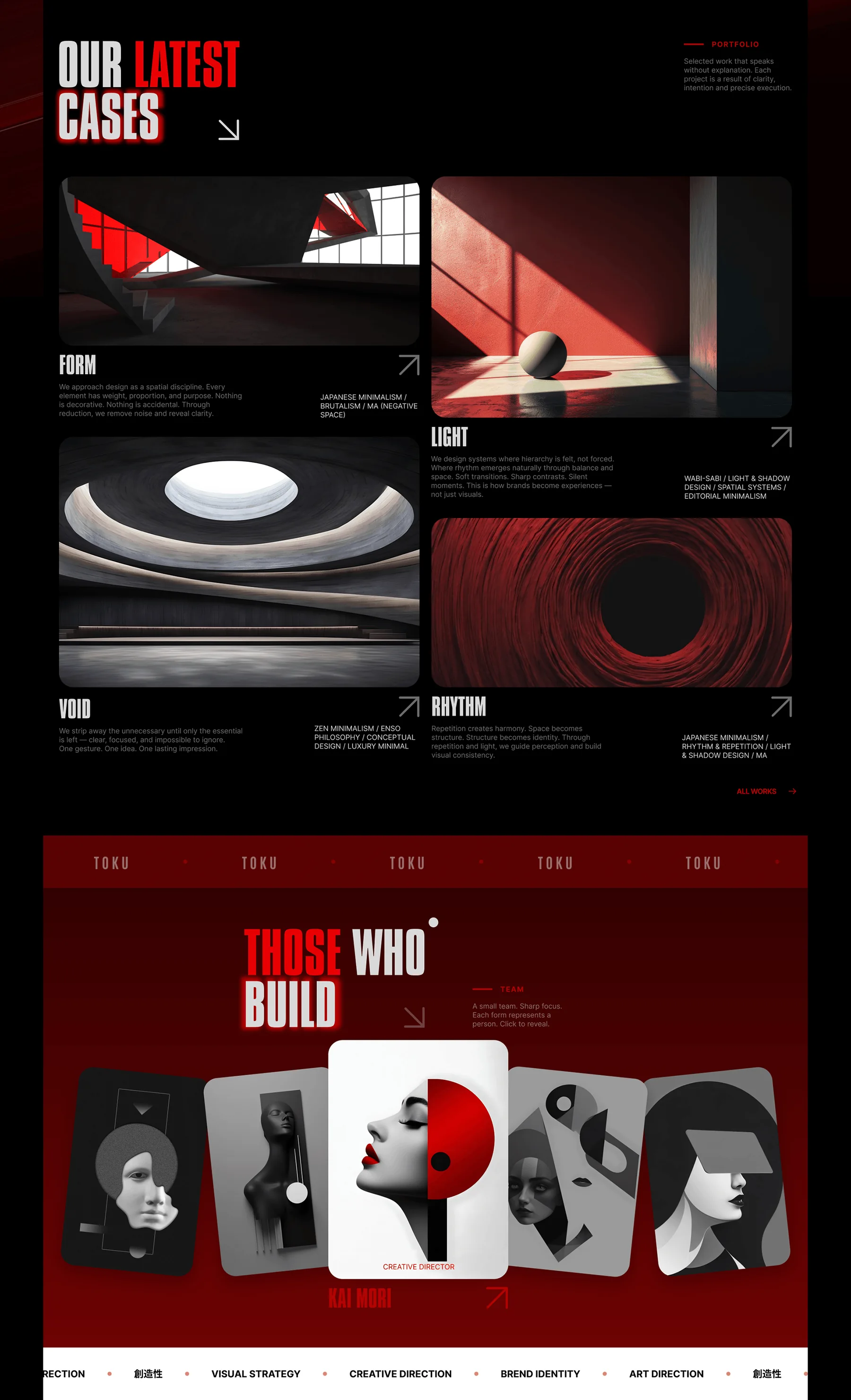
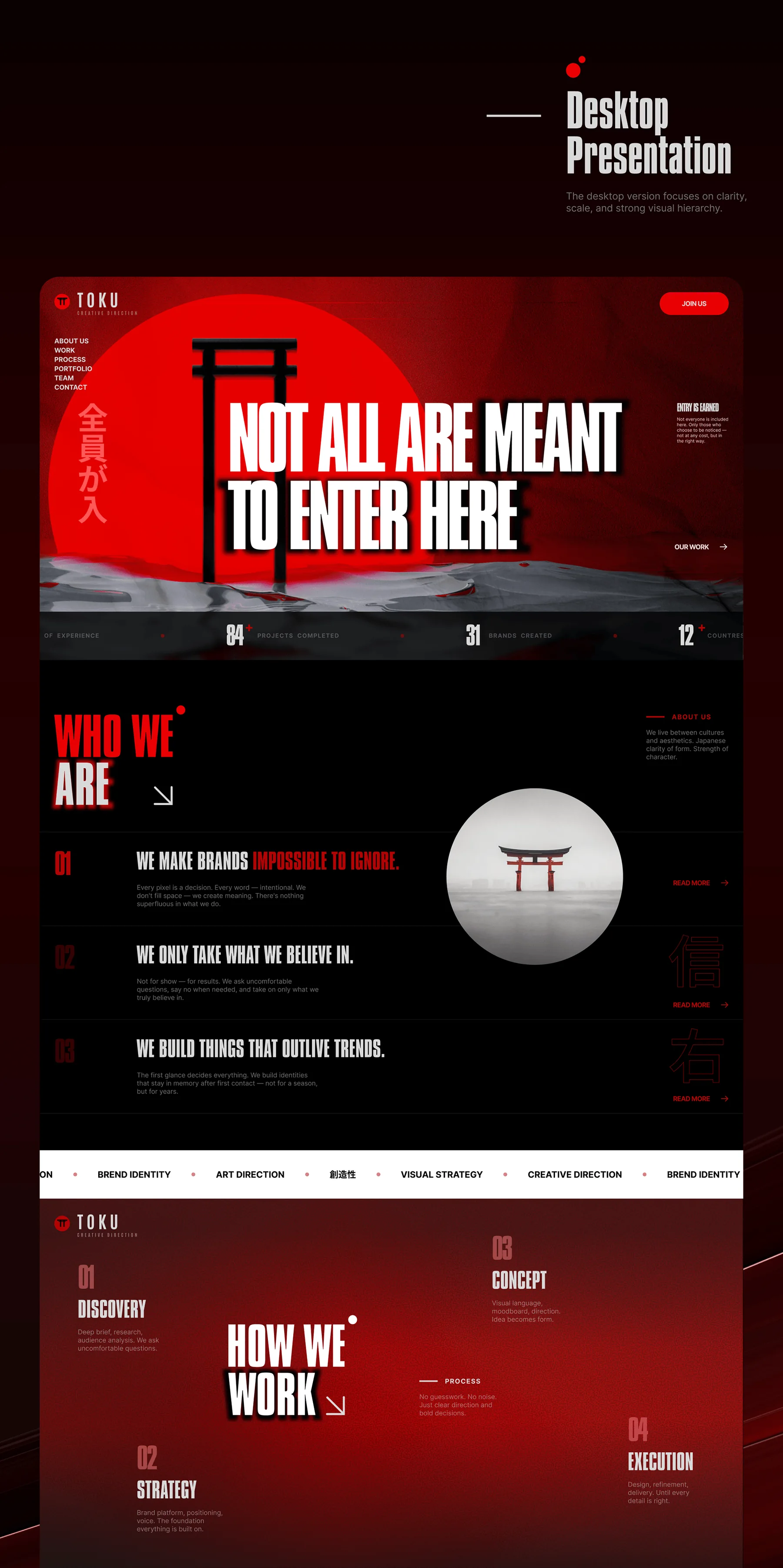
Typography / rhythm / hierarchyDigital system
Have a project?
Let’s make it worth choosing.
Strategy, web design, UI/UX, branding and development—built around the problem rather than a pre-set package.
Start a conversation ↗